It is hardly ever the case that I work on a single side project for years, a sentiment that my fellow software developers might share with me. This blog that you're reading this article on is one such rare project. And although there have been crests and troughs in terms of my activity here, it has been fairly consistent, especially considering my reputation of abandoning projects.
Anyway. Where I was going with all that blabber was that this template that you're reading this on is already two years old now, and I recently rolled out an update that I was pretty proud of. In this little post, I'd like to outline in brief how I reached the current version of this template and why I'm super happy with the outcome.
Backstory
I created the template by simply removing as many unnecessary parts of my then current template as possible and making it a simple, one request only template. It was essentially a blank HTML page with few lines of CSS, no JavaScript, default browser font and styles. Of course, it was blazingly fast but also quite ugly. I went to the extreme end of the spectrum as my starting point.
Slowly, I added stuff to it, on a strictly per-requirement basis. More CSS, some JavaScript, introduced SCSS to make the CSS maintainable, made the JavaScript optional as not everyone needs a dark mode and so on. I made the project installable via git submodule so that it is easy to customize it and at the same time pull updates from upstream.
Current status
It feels good to not trigger advertisement and tracker blocking tools like uBlock Origin. And by not loading hundreds of kilobytes of minified code that contains trackers, suboptimized routines and who knows what, I'm also being fair to my visitors who, when you think about it, trust you as the web developer by loading and executing your code on their machines.
On a more objective side of things, here are a couple of features (copied over from the project's github readme) I'm super happy to announce:
- Lightweight, <10KB CSS, <3KB (optional) JavaScript + 15KB Open Sans font file + your content. That's less than 40KB transferred for most pages
- Highly accessible with semantic HTML
- Structured data (schema.org) pre-added for blog posts
- Dark mode (requires JavaScript for toggling class and saving user preference in cookies)
- Reading progress slider on top (requires JavaScript)
- JavaScript is optional (turn it off in _config.yml)
- No request made to any third party
- Installable as a git submodule
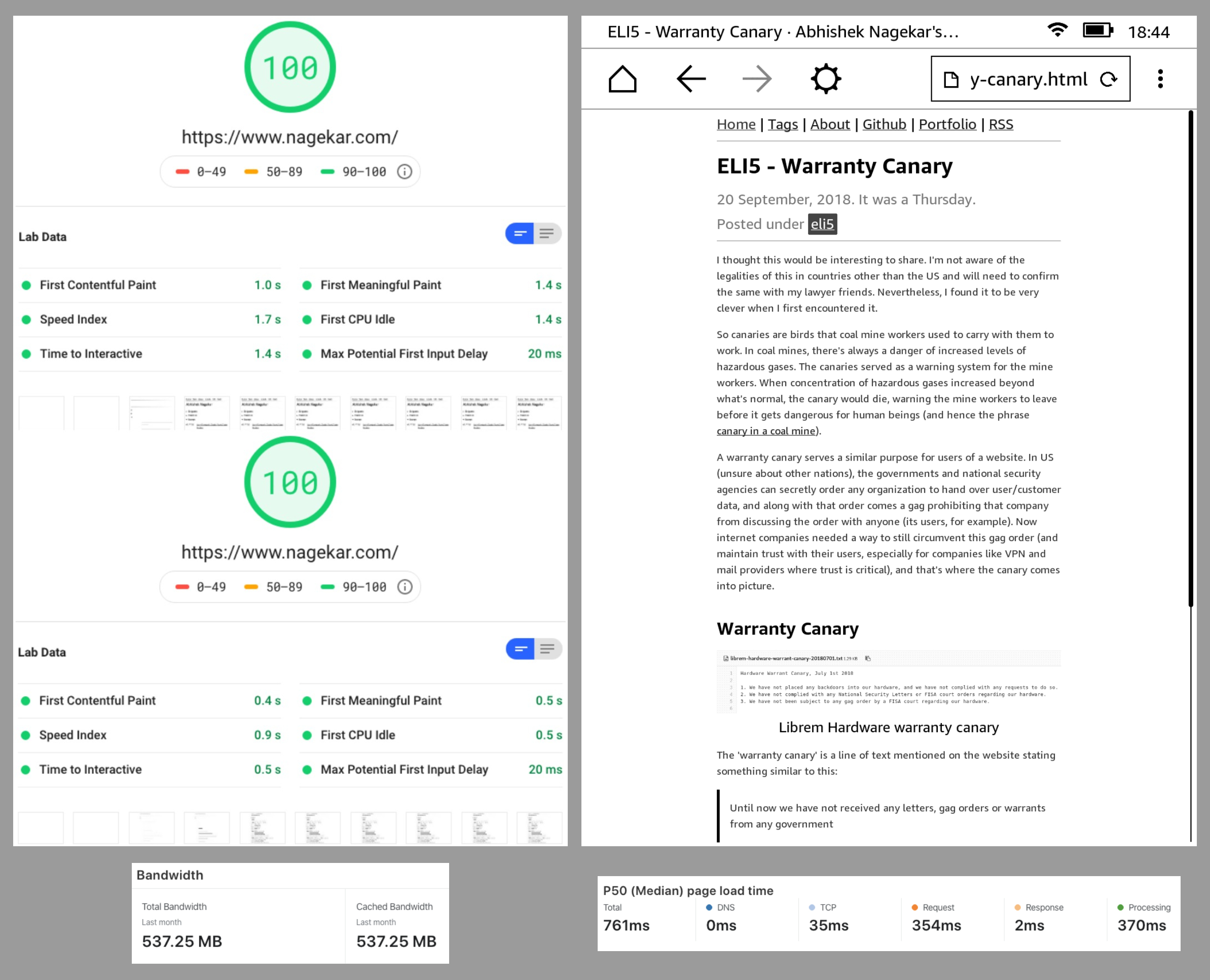
Try the project here: https://elementary-jekyll.github.io/. Below is a picture collage of interesting observations about the theme.

Here's what the dark mode toggle looks like.

And this is the scroll progress indicator

Todo and future
I'm probably not going to give up on this template just yet. But I really want to move away from Jekyll now. No, I don't dislike it. It is probably perfect if you just want to focus on writing as a person who doesn't mind using text editors and the terminal. I just want to be able to dig into the source code of the build tool, the configuration files, write a plugin myself, be more comfortable with the whole ecosystem in general. To do that, it is important that I move to a tool that's written in a language I know, or want to learn. Jekyll, and hence Ruby, just isn't either of those.
If you're thinking of starting a blog, or moving to a new template and see this one a good fit for your taste, do give it a shot. In case you actually end up using it, please write to me. Of course, it is open source and GPLv3 licensed. In the future, if I manage to move my blog elsewhere, I'll port this template to the new system.
I remember wanting to have a simple static site generator after having struggled with tools like Wordpress and Blogspot for this blog. I've reached a point where I feel like I need some of that complexity back. Guess I've reached the other side of the sine curve!
Thank you for reading.